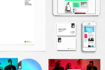
The austria association for brewing trade made a contest to get a new logo. This is my submission – more sketch than concept and not even the winner – but I don‘t want this document to end up in a drawer. Enjoy.
My aim was it to take the old logo and transfer it to the 21th century. It is important that everyone get the link to the old logo. The redesign had to be cleaner, more modern but also kind of timeless with an international and high-class look.
Thank you for watching!
Wanna see more? Keep in touch and follow me.
You can also visit my website for more projects.
Wanna see more? Keep in touch and follow me.
You can also visit my website for more projects.


